Holy crap, I have a blog! Would you look at that….
I guess it’s time to come back from my long, unintended hiatus with a masterful post, a deluge of new content, and a heaping helping of run-on sentences (I guarantee only one of those three). Let’s get started! …with something that has little to nothing to do with college! Woooooo
Which era are we in now? It’s not modern, I know that much. As little sense as it makes, I know we’ve already reached at least post-modern, so we’re at the very least past that. Anyway, it seems as though we have entered the post-post-post-apocalyptic-modern era where simplicity reigns and creativity has gone straight out the door. I’m talking about logos, people. LOGOS!!!
Logos are like, really freaking important and stuff, man. They *are* the very identity of the product or company since it’s usually the first thing we think of or at least identify. For little kids that can’t read, even just the very shape can be recognizable as long as its memorable. …d…did you see that? I said memorable. As in creative. I’m gonna say those words again in italics in-case you didn’t understand. I said memorable and creative. Ok? No wait, let’s do it again in bold and capitals too. MEMORABLE and CREATIVE.
I’m repeating those words because apparently companies have forgotten them. In their effort to seem post-quasi-metaphysical-modern, they’ve abandoned the character of their old logos. Forgoing character…in order to make room for “segoe” and…I dunno, “arial” or something. Shit fonts, basically. Boring….shitty fonts.
Maybe I’m just a product of the 90’s. And maybe I’ll end up failing all my advertising classes. But I like my logos to have some color. Some swirl. Some shading, maybe. Basically, something that wouldn’t be easily duplicated simply by choosing the correct font in Microsoft Word. Which, conveniently brings me to my first victim:
Microsoft.
Here was their previous logo:
![]()
…and here is their new logo:
![]()
….alright. So we’ve got a multi-colored box that I guess is a representation of Windows. Alright, I can dig that. Windows really are more boxy like that than the curvy thing that was supposed to be Windows over at Windows 7, etc. This even works with their new metro interface on Windows 8 (ok, it’s no longer referred to as “metro,” but since they never gave it back a real name, I’m calling it that).
But the logo typeface. My god. That is painfully normal. And grey. Who do they think they are, Apple? Seriously, this just screams copy-cat. At the very least, unoriginal. When I see Microsoft’s new logo, I think of Apple’s stuff. Like, look at this:
![]()
It’s not the same by any means, but it has grey and simple font as its driving force. Same with Microsoft. Close enough to make my gut reaction “APPLE!” at the very least.
Now, I get that Microsoft wants to modernize itself. But it had a cool swirly sort of look before. It was especially well pulled-off with its game studio:
![]()
Dang. I’m sorry, but I really like this logo. It just looks exactly like a cutting edge professional technology company made a game studio. I’m going to miss this logo.
Next victim:
eBay
Old logo:
![]()
Alright. Not entirely indicative of what they do, but I suppose the variety of colors and how they are laid out do show the diversity of what’s sold, as well as possibly evoking a feeling of ups and downs…similar to prices when bidding goes on. Overall, a solid logo.
Now, the new one?:
![]()
It’s shit. It’s the same thing, but worse. You can’t have a straight line of multi-colored, simple-looking letters like this. That’s Google’s territory. I…I really have nothing more to add here. It’s just…no. You guys could learn a lesson from…
Tropicana
Old packaging:
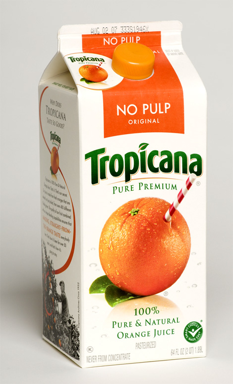
New:

“Now wait a minute…” You’re probably saying. “This new packaging is more ‘shit’ than that new eBay logo you were just slamming. What gives?” Well, my dear disembodied voice of reason, I’m mentioning this packaging in a positive light because of what Tropicana did after putting it out: they took it back. That’s right, after losing sales because they looked like the grocery store’s generic brand instead of the top dog it was once, they decided to change back. They changed too much, and in a terrible way too. The old (and, well, current again) packaging is about as iconic as it gets for orange juice. An orange with a straw in it. What could be more fresh than a brand with that on the package? Nothing. And I’m guessing a good portion of Tropicana’s sales can be owed to that packaging. You don’t go changing a good thing. Because when you do, you get:
Cousin’s Subs
Old logo:
![]()
It had a golden sort of yellow, making you almost taste this “better bread” they talked about in their slogan. The font of the “Cousins” gave you that home-made, countryish sort of vibe. Country may not be everyone’s favorite type of music, but the word “country” and the word “music” are usually the perfect combination. But I shouldn’t forget to mention the solid red of the typeface, signifying a bold, hearty taste. MMMM, I just want to eat Cousin’s right now when I see this logo. Now let’s look at their new logo!
New logo:
![]()
Holy fucking shit that’s so bad I think I just lost all the appetite I just got from the last logo. I…wow. They really fucked this up, I’m sorry. It’s bad. It’s so bad, I wouldn’t be surprised if Cousins’s Subs are in financial trouble thanks to this. …actually, now that I think about it, I swear I haven’t seen as many as I used to…
Ahem, anyway. Yeah. What makes this logo so bad? Well, let’s start with the background. It’s like your typical yellow gradient isn’t it? But why is it a gradient? What is this supposed to evoke in me? What’s with the yellow they chose? That’s not a bread color. And not any kind of mustard I like either. It’s nothing. It’s a pointless change for the sake of change. Same with the font. Why did it change to this? I guess it’s “crisper” which I guess might signify “freshness” or some crap like that, but I don’t buy it. It looks like it’s for a financial firm or something. Actually, that “C” looks perfect for “Cost Cutters,” let’s give it to them for a new logo. Point is–it’s not a food font. It doesn’t belong. It has no personality. Wait a minute though…the border…is that a hint of green I see in addition to the black there was before? Why? For lettuce? Are you kidding? I…wait. I just realized what this reminds me of. It’s like those shitty Word fonts people used. You know, in 3rd grade? When you needed a fancy looking title that could take up a bunch of room? Yeah. This shitty, tri-color scheme of genericness reminds me of that. Terrible. Just terrible.
Before I wrap up, let’s quickly look at one last company,
Wendy’s
Old logo:
![]()
New logo:
![]()
This…works. I guess. It’s not great. It’s certainly not an upgrade. But on the same level of decentness? I suppose so. I preferred the old-fashioned idea. Those square patties and old-fashioned burger ideals were what made me respect Wendy’s back in the day. But respect doesn’t always attract customers. And this new logo might do the trick. It’s…friendly looking, I guess. The wavy, hand-written sort of font feels welcoming. You feel like you’re going to get a meal prepared just for you here; hot and fresh and ready to disappear inside of you.
Wait…what’s with her face. It looked friendly at first, but now….now I just see….
![]()
…creepy eyes staring at you when you sleep. Waiting for the right moment to eat you….
*shiver*
Well, I’m done here. Time to have some nightmares.
